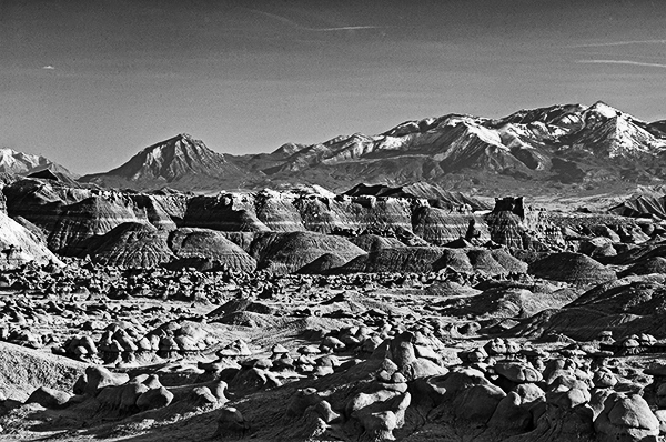
The stark tonalities of Entrada sandstone on a late-afternoon cloudless Southern Utah day make the decision to create a black-and-white conversion of the hoodoo population of Goblin Valley and the ever-watchful peaks of the Henry Mountains to the southwest both interesting and straightforward.
The last mountain range to be added to the map of the lower forty-eight drains its waters into rivers with names like Fremont, Dirty Devil and Colorado (now in the form of Lake Powell), speaking thus to history of western exploration.
A focal length of 150mm. right in the middle of medium telephotoland, gave me the angle-of-view I wanted and some compression to bring the mountains nearer to the goblins for relational reassons. An aperture of f/22 provided depth-of-field, and a shutter speed of 1/5th second at ISO 100 gave me an overall medium exposure.
The igneous intrusions that led to the Henry Mountains formed some 23 to 31 million years before the present; and while Goblin Valley is a Utah State Park, the Henrys are administered by the Bureu of Land Management. As public land owners, our voices rightfully help determine the disposition of these amazing lands if we speak up for them.

Having been to Goblin Valley once with you I have a brief acquaintance with it in color. But, yes, changing it to B&W changes the image to expose the skeleton of what forms the vista you see in color. Thanks for such a graphic example of line and form.
see above
Having been to Goblin Valley once with you I am briefly acquainted with it in color. But changing it to B&W transforms the image. It’s as if suddenly you are seeing the skeleton of the vista before you. Thank you for such a strong example of line and form.
Hey Chuck. Thanks very much for joining me for this conversation. It is always a pleasure to hear from you. I’ll address both of your comments here, if that’s okay with you. Indeed, you and I have shared some wonderful adventures in the Southwest, not the least of which was an excellent visit with the goblins. I like your thoughts on the conversion to B&W here: the absence of color very much emphasizes the other stand-out elements of line and form. It has always seemed to me that one of the sure ways to judge the propriety of making a B&W conversion is to see whether, in the absence of color, there is another element that seems to appear as strongly rendered as the color. In this instance, the shapes, forms and lines all stand out strongly with the strong color of the redrock missing. Thanks very much for pointing us in that direction. Be well and Walk in Beauty, my Friend.
Thanks for this image, Don. Seeing a western landscape in B&W always takes me back in memory to two of the first awakeners of my childhood interest in photography, Ansel Adams and Life magazine. I love how the B&W treatment brings out the thin white strata across the middle. A magnificent image!
Don. Just awesome again
Hey Mike. Thanks so much for joining us. I hope you have kept safe in all of the confusion that has surrounded us lately, but have also found ways to continue to express your creativity. Thanks, as always, for your very kind words; I appreciate that this image has resonated so strongly with you
Howdy Donald. It’s always a joy to have you join me, especially since our memories of photography in our childhoods run in such parallel tracks. I well-remember the excitement I always felt upon seeing Ansel’s wonderful images from our magnificent national parks; and off-and-on my parents had a subscription to Life that allowed me to again-and-again appreciate the beauty of our natural world he shared with us. Those mid-ground white layers of sandstone are certainly enhanced by the absence of color. I plan to visit the goblins again in late-September and wish you were going to be with us.Stay safe and be well.
Don, such interesting zones of shapes in this image. My immediate response was “look at those curves and lumps” then “oh, the horizontal lines in the mid-ground” then “whoa, those are some real peaks back there.” Soft to flat to sharp. Love it.
Hi Ray. I hope you have been safe and well. Thanks very much for joining us. I really appreciate your description of the divisions of this composition. It ended up being an almost even 25% division: hoodoos, sandstone strata, mountains and sky. In the final result, it was the feeling of balance at these divisions that ruled the day. The Henrys in the background top out at 11,000’+, so they do actually have some height to them, and they are home to one of only three free-range and genetically pure-bred bison herds on public lands in the country. Have an excellent week and walk in Beauty.
Thanks, Everyone, for taking the time to join us and to offer such interesting and thoughtful insights into the creative process present in this image. The decision to convert a full-color image into a B&W creation is always an interesting process. Remembering that the elements of graphic design include line, shape, form, texture and pattern in addition to color always encourages us to consider whether the image as a whole is so strongly represented by one of the elements other than color that choosing a black and white rendition actually adds visual strength which the color does not provide. If the answer to that query is affirmative, then the decision to convert is a fairly straightforward one. Have a beautiful week and walk in Beauty always.